


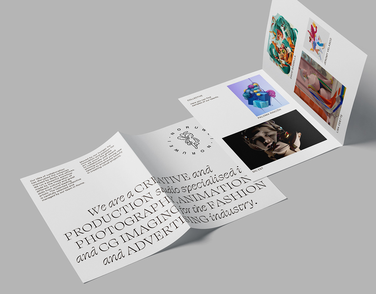
Noruwei is a full-service creative and production studio, collective, and art unit based in Rome, Italy. They create unique content by fusing diverse cultures with globally recognized artists with a commitment to innovation and dedication to beauty. Noruwei wanted to update the visual identity to communicate the company in a more unique, fresh, and attractive way. Kokoro & Moi was responsible for designing the new identity.
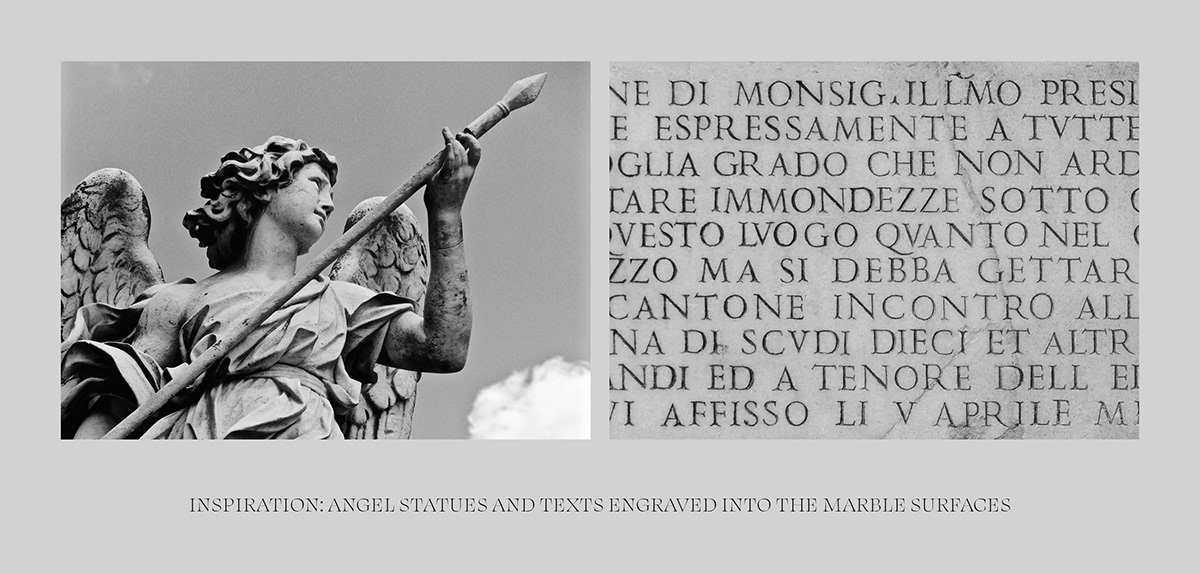
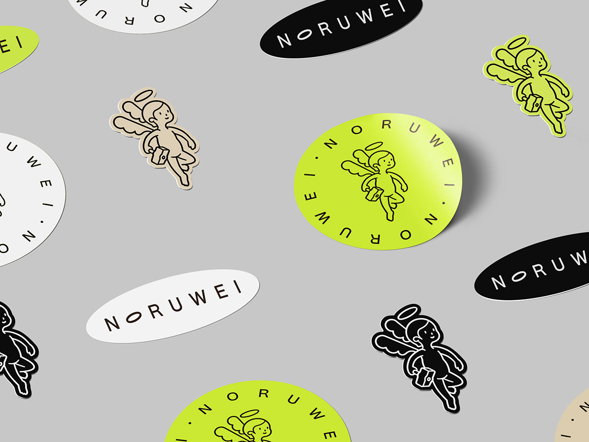
In Rome, angels are all around. Whether sculpted in marble and standing atop bridges or frescoed into Renaissance churches, winged guardians can be found everywhere. The aspiration for Noruwei was to have an angelic figure as the centerpiece of the visual identity, creating a connection to their hometown. However, instead of a realistic figure, the aim was to infuse the character with playfulness and approachability, which would better convey the message of Noruwei as a creative agency in the field of visual culture. The result was a positive and gender-neutral illustrated character inspired by the Japanese cartoon style.
References for the typography were also found in Rome. Ancient texts were often engraved on the marble signs and surfaces of buildings, using a serif-style font and capital letters, which was typical of the time. This inspired the typography we chose for the identity. Swear Display (and its Light and Cilati styles) by OH no Type Company was used as the primary typography, which playfully appears in headlines and highlights, alternately with words written in uppercase and italic style. In contrast to the expressive Swear, a versatile and sophisticated PP Mori, a gothic sans serif inspired by contemporary Japanese design, was chosen.
The color palette was kept very limited: black and white are the main colors, with bright neon yellow as an accent and a hint of aged marble as a secondary color. The result is a visual identity rooted in Rome, with influences from Japanese aesthetics and Scandinavian minimalism.


